Everything to Know About the San Antonio Spurs Logo
We examine the history and meaning behind the San Antonio Spurs logo (Photo via NBA.com)
As a San Antonio Spurs fan, you have seen the Spurs logo a million times in a million places. You probably own merchandise featuring the design. But how much do you know about it? In this guide, we will tell you all about the history and meaning of the San Antonio Spurs logo. We will also explore how the logo has evolved over time.
What is the San Antonio Spurs Logo History?
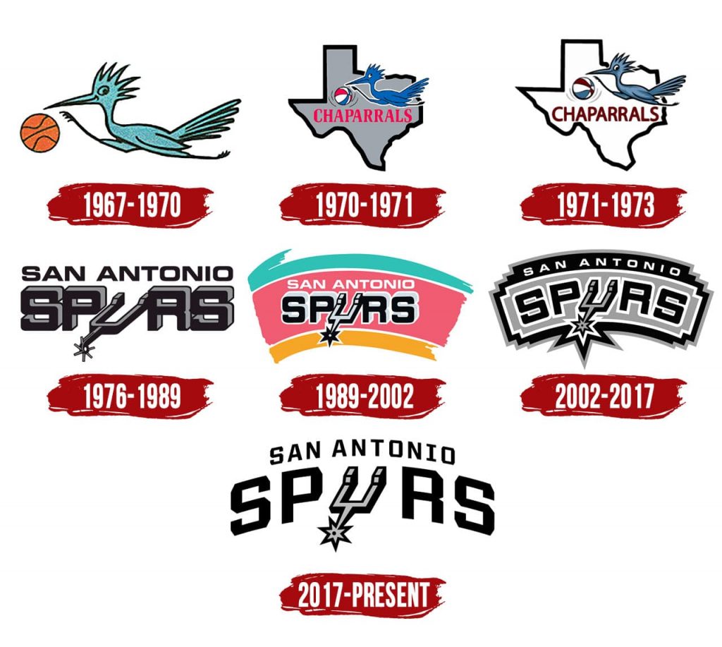
Once upon a time, there was a team known as the Dallas Chaparrals that became the Texas Chaparrals in 1971. That team’s logo was a blue chaparral bird and a basketball. The basketball was originally orange, and later multicoloured.
When the Chaparrals got new owners, they relocated to San Antonio in 1973. That was when they entered the NBA. For a brief period, the team was called the “San Antonio Gunslingers,” but they never played a game under that name. The owners decided to change the team’s name, and held a contest to choose a replacement. The winning name was “Spurs.” With the new name came a new logo.
The San Antonio Spurs Logo Meaning
Both the name and logo “Spurs” reference cowboy boot spurs. The purpose of wearing these spurs is so that cowboys can direct their mounts. The choice of name for the team pays homage to the western heritage of Texas. Also, team investor Red McCombs’ place of birth was a small town in TX called “Spur.” So, that could have been a factor in the selection of the name for the team as well.
The San Antonio Spurs Logo Through the Decades
Now you know how the Spurs got their name. Let’s talk about the original logo design and how that design changed over the decades.
- 1974-1989: The first version of the Spurs logo featured 3-dimensional text reading “SPURS” under 2-dimensional text reading “SAN ANTONIO.” San Antonio was in black, and “SPURS” was in black and silver. The spur itself is the “U,” placed at an angle, with a fairly realistic design.
- 1990-2002: The logo got a redesign in 1990. The basic wordmark remained largely unchanged, but “SAN ANTONIO” was changed to white. The Fiesta orange, pink and teal swooped in the background, celebrating the city’s diversity.
- 2003-2017: A major redesign followed in 2003. The team did away with the Fiesta colors, but kept the swooping “flag” shape. It included a silver background with a jagged black border around that and another border of silver around that one. SAN ANTONIO is in white, and SPURS is in the Eurostile typeface in black with white around the letters. This time, the letters all have an “arched” effect, unlike in the previous wordmarks. The spur itself substituting as the “U” is at less of an angle than it used to be. It also looks a bit more stylized. The rowel of the spur appears kind of like a star.
- 2017-Now: The “arched” layout of the words remains in the current San Antonio Spurs spurs logo, but the bordering and background around them is gone. This version of the logo is fairly minimalist in nature. Whereas the letters in the previous logo were tilted, they feature no rotation in this one (they are all situated along the same axis). The typeface for “SAN ANTONIO” now matches “SPURS.” Black is used for both, but the “U” spur remains 3-dimensional in black and silver. It also retains the stylized appearance.

An Evolving Logo for a Beloved Team in a Dynamic Community
Now you know what the Spurs logo means, how it came into being, and how it has changed over the decades. But how will it transform going forward?
There is really no way for us to predict the future. Most recently, the team brought the Fiesta colors back, this time for the 2020-21 jerseys. Indeed, this was something that fans were requesting for a long time. Does this mean that we could also see a return of the Fiesta colors to the San Antonio Spurs logo? It certainly seems possible. But being as the logo changed not all that long ago, it is hard to picture another change this soon. But who is to say? Regardless, it will be interesting to keep up with changes to the logo in the future and what they represent as far as the team and the San Antonio community are concerned.


